Visual Identity & Design Applications
Creating a cohesive visual system across brand and promotional materials

Project Overview
Brandtribal developed the visual identity for Culture of One after defining the brand strategy and messaging framework. This work translated the strategic direction into a practical visual system, including logo development, colour palette, typography, and supporting brand assets.
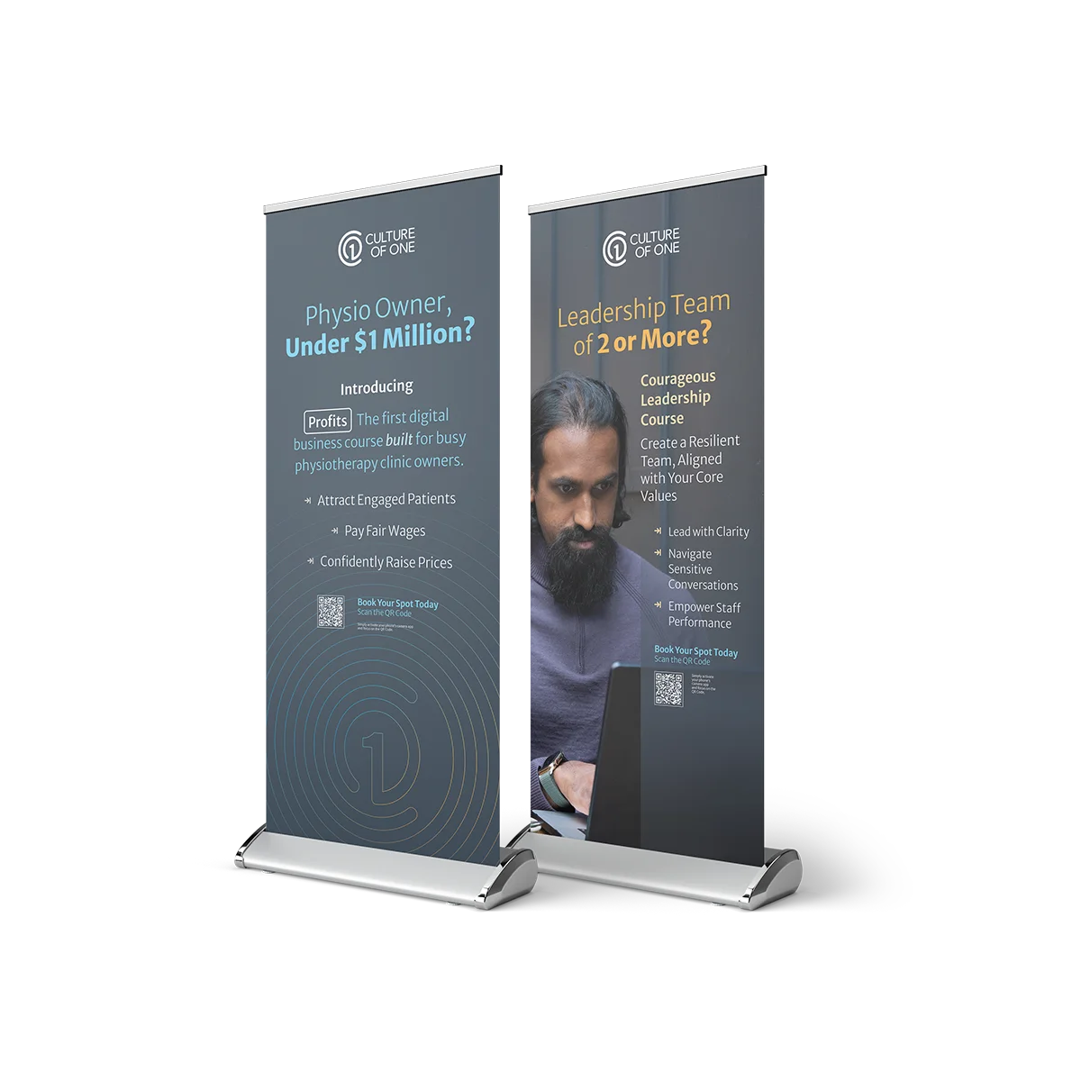
The identity was then applied across key promotional materials, including an A5 flyer and pull-up banners, helping the brand appear consistent across both digital and physical touchpoints.
The visual identity documentation outlines the rationale for the project, the brief guidelines, the colour system, and the typography choices used to support the final direction. The chosen colour system balanced confidence, clarity, and warmth, while typography was selected for readability and consistency across web and print.
Key Highlights
- Developed the visual identity from the strategic brand foundation
- Created a clear colour and typography system
- Applied the identity across flyer and banner collateral
- Built consistency across digital and print touchpoints
Our Approach
The visual identity was developed as a direct expression of the strategy already established for the brand. Rather than creating a purely aesthetic solution, Brandtribal built a system that aligned with the brand’s values, audience, and market position.
From there, the identity was extended into practical applications. The flyer and pull-up banners used the same typography, colour direction, and graphic system to create a cohesive look that supported promotion, brand recognition, and real-world use across different formats.
The A5 flyer and banner artwork show how the visual identity was carried into promotional collateral for specific offers and events.
Project Result
Culture of One gained a clear and recognisable visual identity that could be used consistently across its website, promotional materials, and broader brand presence.
The identity system strengthened credibility, improved cohesion, and gave the business a more polished and professional presentation.

Project gallery
Creating a cohesive visual system across brand and promotional materials
Explore more work
A collection of projects built to solve real problems, sharpen messaging, and create lasting impact.
Logo Rebuild & Brand Asset System